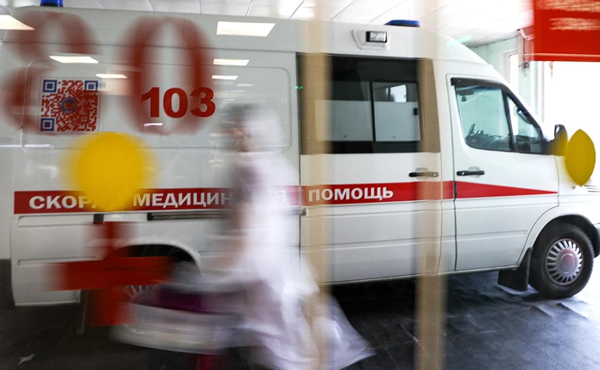
Form as a means of navigation: ambulance suburbs change clothes
Moscow ambulance introduces color coding of brigades
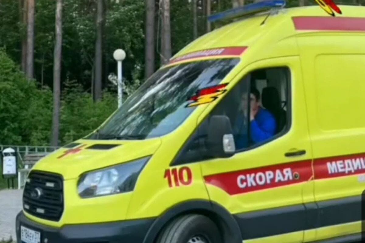
The Moscow regional station of ambulance began to distribute new sets of uniforms to posts and substations. This was reported by the regional Ministry of Health and the chief doctor of the service Konstantin Egorov. The key innovation is not cut or fabric, but the color stratification of employees:
Red – employees of resuscitation brigades;
- Vasilkovy (light blue with a purple hue) - general field teams;
- Dark blue - ambulance drivers, and their shape is supplemented by reflective stripes.
The kit includes T-shirts, polo, short and long-sleeved shirts, jumpers, vests (which, according to the station, increased the number of pockets), summer and insulated trousers, demi-season and winter jackets, as well as hats. The update will receive not only outbound teams, but also dispatchers and senior doctors of substations.
The scale of the purchase is impressive: more than 10 thousand sets are provided for eleven regional ambulance associations of the Moscow region. Only at the Krasnogorsk substation in early November issued 400 sets.
An important detail that usually remains behind the scenes of news about “beautiful uniform”: all clothing belongs to personal protective equipment, has confirmation of compliance with technical regulations and mandatory digital marking in the “Honest Sign” system. This means that under the guise of a “Moscow ambulance” on the market will not be able to appear fake kits.
Formally, the comment of officials boils down to the fact that during the development, “we took into account the wishes of employees – from color solutions to the convenience of materials and cuts.” However, behind this there is a quite pragmatic operational necessity, which was indirectly confirmed at the Krasnogorsk substation: when a large number of brigades arrive at the site, it is visually easier to determine that a doctor in red uniform is an intensive care worker, which means that he should be treated first of all with serious patients.
This is especially critical in mass-accident scenarios, where the count goes on for seconds, and dozens of people in the same yellow-green or white “classic” vests work on the spot. Color coding turns a crowd of doctors into a readable structure: red - heavy, cornflower - medium and primary care, dark blue - logistics and evacuation. In fact, it is a visual analogue of medical sorting, only worn on the shoulders.
Moscow usually sets standards and the region catches up, but this time it’s the opposite. It is the Moscow region that is testing a model that can be useful precisely in the conditions of the huge length of the region and the heterogeneity of challenges - from megacities to remote areas.
If you compare with the world experience, the color solutions in the form of emergency services is a field of constant discussion, but the focus there is shifted. In the Netherlands, in 2019, ambulance workers began testing the rejection of traditional fluorescent yellow-green in favor of turquoise. The medical argument was psychological: The bright yellow jacket is quite intimidating. New colors radiate calm, an ambulance employee gave an example. At the same time, the representative of the Belgian association Willem De Koelar noted that European directives require a certain degree of visibility, and only red, orange and yellow remain permissible fluorescent colors. He said the Dutch choice of turquoise "deviates from this at the expense of visibility.".
Here there is a key difference of the Moscow approach: it does not replace the signal elements (reflectors on the driver’s uniform are saved), but adds functional differentiation on top of the basic safety. The red resuscitation kit is not a replacement for reflective stripes, but a marker of the role. In the European discussion, they argue about what color will make the brigade more noticeable and less frightening, in a case near Moscow, the color makes the brigade clearer for coordination on the spot.
Interestingly, in international practice, color often encodes transport (Battenberg marking of ambulances in the UK, Switzerland, Hong Kong), rather than the people inside it. The Moscow region shifts the emphasis from "what the car looks like" to "who is in front of you.".
The shape of the ambulance suburbs really looks more modern, and it's nice. But reform is not about aesthetics. In an environment where three brigades can arrive at the same address at the same time, and the time of arrival of intensive care is measured in minutes, the color on the shoulders becomes the fastest communication interface between medics, rescuers and police on the spot.
The Moscow region relied on functional visualization of roles. Whether the region will succeed what Moscow has not yet done is a matter of practice. But if the red jacket at the scene begins to recognize not only colleagues, but also patients (and this is inevitable), the ambulance will have another channel of trust: people will see that they are going to the one who is needed in the first place.