KHL presented the emblem and corporate style of the Week of Hockey Stars in Minsk
The Kontinental Hockey League has unveiled the logo of the iconic style of Hockey Star Week. It will be held on February 5-7, 2027 in Minsk-Arena.
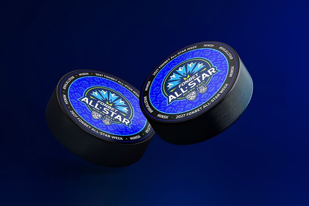
The Kontinental Hockey League presented the logo and corporate style of the Week of Hockey Stars. It will be held on February 5-7, 2027 in Minsk-Arena, writes sb.by.
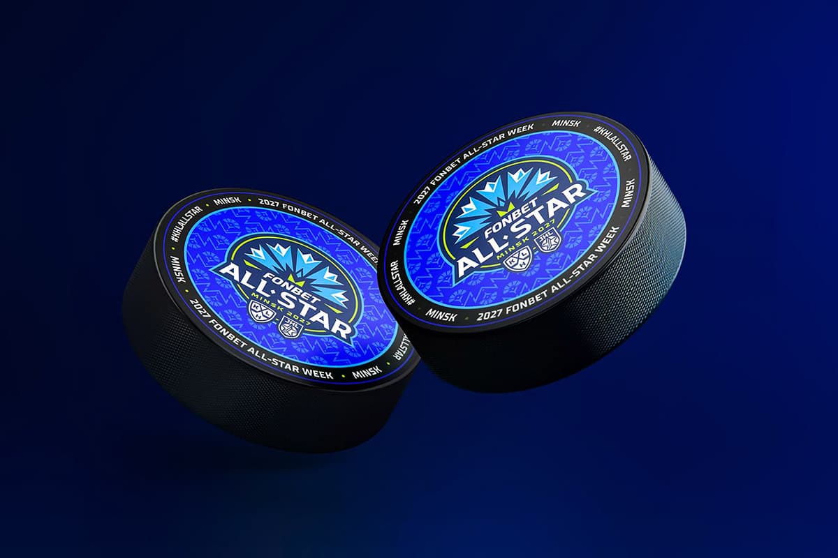
The key visual element of the emblem is vasilek, which represents the Belarusian nature and national identity. This flower, growing in the fields without complex care, reflects such qualities of Belarusians as modesty, diligence and friendliness, and its palette conveys the inner strength of the people.
Stylized geometric cornflower in the design of the logo with its shapes refers to ice crystals, creating a bridge between the national symbol and hockey. At the heart of the composition is the letter M, indicating Minsk as the host city of the tournament. The round shape of the sign is associated with the puck and the central mark of the hockey court, and the strict geometry guarantees excellent readability of the image in any size.
KHL Vice President Sergey Dobrokhvalov noted:
- Hockey Star Week is the league's titular event and we wanted its visual image to reflect the character of the place it will take place. Minsk is a city with a rich culture and a great love for hockey. The logo wanted to combine two components: the recognizable cultural code of Belarus and the ice hockey court. Vasilek, who became the basis of identity, is modesty, loyalty to traditions, diligence and hospitality of Belarusians, who in 2027 will host the best players and coaches of the KHL. I am sure that this image will resonate with fans and hockey players.
The color scheme of identity consists of five shades. Blue and blue convey the color of cornflower and are associated with ice, dark blue acts as a background, salad brings a bright natural accent, and white focuses on the main details. The combination of these tones creates an expressive and easily recognizable visual style. The graphic pattern is based on the geometric shapes of the cornflower and the letter M. The alternation of elements refers to the traditional Belarusian embroidered ornament, thereby strengthening the link between the event brand and the national cultural code.
The match of stars of the Continental Hockey League in 2027 will be held in Minsk
Dynamo Minsk became the most visited team of the KHL in September